
Why people don’t get it?
Many managers have great ideas but poor visual communication which leads to a major frustration: "Why don’t my people get it? The direction we should take is so obvious to me; I told them the path forward; and still, they are not in motion." There can be many root causes of why this is happening but let’s focus on the most frequent ones:
- Too much reliance on verbal communication without any visual picture
- The thinking process that led to the decision is not explained nor obvious
- Sometimes, the direction communicated is just plainly wrong because it did not result from a structured analysis process
- Sometimes it is a very good idea but the communication is about a solution rather than presenting the problem
- Lack of involvement of the people in deciding the specific direction they should take (no "catchball" process)
A painful "theoretical" situation
As an example, let’s assume you have a goal to increase the throughput of your machines measured by “the number of good products per day”. It is obvious for you that the issue is the unplanned downtime, and this is why you decided to start an initiative on “improving maintenance planning and scheduling”. Actually, the envisioned solution was to have a new CMMS.
Unfortunately, what is obvious to you is not obvious for everybody and the initiative is not going anywhere. Progress is slow and, after a year, changes were made with mitigated impact on unplanned downtime. In summary, your throughput did not improve.
The KPI tree to the rescue
The KPI tree is a visual tool that makes the communication of a thinking process very clear and challengeable. In the name, KPI stands for “Key Performance Indicator”. Of course, with a KPI tree, the goal is often NOT to get to a solution but to clearly present the specific problem and provide a path to a solution.
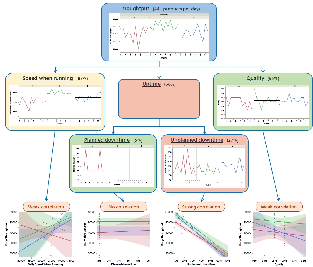
Figure 1: KPI tree for the throughput
In the previous situation, the KPI tree that was built is presented in Figure 1. This figure shows the throughput performance by machine (A in red, B in green and C in blue). It also shows the performance of the different contributors: speed when running, uptime and quality by machine. Already this display of the contributors to performance is an improvement. However, the final touch comes from the correlation analysis at the bottom of the tree. This analysis clearly shows that the biggest driver of the past performance was Unplanned downtime since it has by far the strongest correlation. And this is true for all three machines.
When the tree was presented to the machine leads, they all easily concluded that unplanned downtime is the driver of performance and, for the first time, it really became obvious to them that it should be the focus of their improvement effort.
What they came to realize is that the actual KPI they were looking at (the number of products per day) was not showing them the main cause explaining good and bad days. In addition, when they had more unplanned downtime in a day, they tried to compensate by accelerating the machine speed; which lead to a short term small improvement but had no long term impact on the performance. It became clear to them that they needed to change the way they were managing productivity by:
- Changing the KPI they focused on from the number of products per day to the unplanned downtime per day
- Committing on a target reduction in downtime for each machine
- Visualizing and analyzing the Pareto of the causes of downtime to identify which issue they would prioritize
- Using a standard problem solving methodology to solve those prioritized issue (they received Yellow Belt training and used the DMAIC methodology)
Key learning from this story
- As a manager, even if the path forward is obvious to you, it is probably not so obvious to everybody.
- A visual tool that shows a fact-based decomposition of the problem can help in getting consensus on the issue we need to address as a team.
- Be conscious you could be wrong in your assessment of where people need to focus and trust the KPI tree!
Want to learn more?
At Différence, our core expertise is centered on statistic and data science, Lean applications and operational excellence, and… simulation! Don’t hesitate to ask for more information by contacting us.